By Dr. Rose Reissman
You are not an Arts teacher, nor an effective
illustrator on your own. Your class has
few students who self-identify as artists.
Yet, you want your students to develop captivating, learning-rich
cover designs for a report or project.
One exciting path to learning is giving students the option of using
graphics to craft ‘comment collages’ in their responses to a project prompt. But how to support them in gathering professional
quality images to integrate into their own composite “covers” when you,
the educator, are not an art expert?
One exciting path to learning is giving students
I was working with a special needs, 6th
grade class of students who were completing their class glossary activity for Wonder
(an R.J. Palacio book). They were proud to have completed the jigs awed task of
developing a glossary of terms for that book. Functioning as lexicographers, I had divided the
class into three letter groups- A-J, K-P, Q-Z each identifying and defining
words which were challenging or they felt would be unfamiliar to the readers of
the book.
The book, as published, does not have a glossary as back material, so the students felt that their providing a feature needed, but not yet offered to the readers of this work, would be a contribution. They were able to produce an annotated glossary of between 75-100 words.
The book, as published, does not have a glossary as back material, so the students felt that their providing a feature needed, but not yet offered to the readers of this work, would be a contribution. They were able to produce an annotated glossary of between 75-100 words.
Yet, they felt they could not, either in their small
groups of letter lexicographers, or in their whole class group, develop an original,
illustrated cover for their work.
How to get them “cover” ready?
Quick solution - use the Google image search tool to
guarantee that every student, regardless of art talent, could access the
material needed to produce a beautiful, illustrativecover design; one
that he/she could explain in an artist’s statement.
The students were told that the images they were
using were, copyrighted, of course.
Indeed the major logo for the book (Wonder) was created by its author (and
graphic artist) R.J. Palacio.
I explained to the students that since they were not going to sell their glossaries for cash or disseminate them to the general public, but rather, share them with other students within the school as part of a learning project, they could use images they found to create a collage that they would use in their original covers.
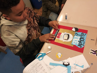
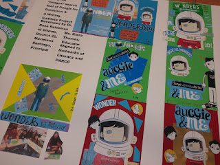
Photos provided by Dr. Rose Reissman
I explained to the students that since they were not going to sell their glossaries for cash or disseminate them to the general public, but rather, share them with other students within the school as part of a learning project, they could use images they found to create a collage that they would use in their original covers.


Photos provided by Dr. Rose Reissman
Directions to the students were:
1. First,
enter into the Google search engine the title of the book that they’ve been working
on and now want to “cover.” With the R.J. Palacio book “Wonder,” the search term
was “Wonder, Palacio, book, movie.” For
future classes working on a topic-driven report, they can similarly enter a
description of the topic as a search term.
2.
Next, click “images” to launch the search
tool which would immediately find and display an array of images from among
which the student can select.
3.
The student should select from among the
images a minimum of 3 to 4 which he/she feels are engaging or striking and
perhaps, help communicate meaning.
4.
These images should be printed out in
color.
5.
Once the images are printed, the
students can work in groups or individually to extract (cutting with scissors) segments
of the image that they, as illustrators, feel would contribute to their
creation of a collage that is at once interesting or beautiful visually, and
that conveys some sort of meaning in relation to the book or project theme they
are focusing on. In all of this, they are free to follow their taste, interest,
and personal perspectives.
6.
Next, students arrange the various
visual elements they’ve assemble into a single design that will be a cover
image for their topic or theme.
7.
When they have finished the design of their
arrangement, they can then paste the collaged design onto a heavy paper or
cardstock.
8.
Next, the student graphic designer needs
to provide a 3 to 5 sentence description of why the images used were selected
from the pool of images that came up in the search. Have the student express
what aspect of the book's or topic's theme, the student wanted to convey
through the cover designed.
9.
These statements can be shared with peer
designers.
10.
If all students are working on a new
cover for a specific book or theme, but working with a core of the same
downloaded images (a set of 10-15 images all have access in common to) ; the
students can reflect on how it is that even though they were all drawn from the
same pool of images, the covers all turned out differently.
Beyond the visual
elegance of the covers developed by students in a literacy class, the students
learn many valuable lessons from this fun and exhilarating, assured success
experience.
They learn that a
graphic artist can be someone who does not necessarily design images by
hand, but rather selects and arranges existing ones to create a new meaning or
express an individual perspective on a theme.
They
learn that even within a single pool of downloaded images, there is room for
the individual’s approach to the design challenge. A potential field of life work, graphic
design can be introduced to the student through this exercise.
In the discussion of
their covers, the student learns that one can “read a piece of art” (Edutopia-march
28, 2019). Visual literacy in this
discussion involves making connections to the theme, finding inferences about
the topic, and connecting explicitly in words, the graphics chosen and
positioned to the designer's perspective on the topic.
The students also can broaden
their communication repertoire beyond just talk or writing, to include the visual
design process.
The individual students
can explain the strategies needed to implement their cover designs as well as
discuss mood, choice of colors, tone, atmosphere and inference the students
“infused” into their design.
Jennifer Anne Ford, in
the Australian Library Journal, Vol. 65, 2016-Issue 1, notes that uses of cover discussion to engage
students in the topic , theme, or textual world within a book is the “first
link a prospective reader has” to that text. Thus, a worthwhile precursor to the activity
described here would be to have students talk about how individual graphic
designs (covers, etc.) can link readers to the meanings of themes conveyed by
books.
While this activity can
be used with the full spectrum of students, grades 4-12, it is good to know
that as Dr. Ford states “the issue of the creation, reception, meaning and
implications of a cover can be articulated with secondary students as part of a
critical analysis of the text itself.”
In the music recording
world, singers often “cover” a hit song by rerecording it with their own
stylistic tempo or tone shift. This
further celebrates the original hit and enhances its audiences. In the students’ developing graphically designed
covers for their glossaries, they were doing the equivalent of the lyric
singers who “cover” an original song with their own emphasis or style, drawing
from the original – but still different.
By “covering” a book,
topic or theme with downloaded graphic images collaged into individual student
designs, a new generation of visual literacy readers can be developed.
This project was first developed at Ditmas Middle School with the special needs ELA 6th grade students of Kiera Thomas and the support of push in specialists ESL educator Mrs. Cataldo and ESL educator /reading specialist Ms. Michele. Ms. Santiago is the Principal of Ditmas and Ms. Buitrago is the supervising AP.
This project was first developed at Ditmas Middle School with the special needs ELA 6th grade students of Kiera Thomas and the support of push in specialists ESL educator Mrs. Cataldo and ESL educator /reading specialist Ms. Michele. Ms. Santiago is the Principal of Ditmas and Ms. Buitrago is the supervising AP.
The Australian Library
Journal
https://doi.org/10.1080/0049670.2016.1125757

Rose Reissman is the founder of the Writing Institute, now replicated in 200 schools including PS 191 in Manhattan, New York City. She is a featured author in New York State Union Teachers Educators Voice 2016 and was filmed discussing ESL student leadership literary strategies developed at Ditmas IS 62, a Brooklyn public intermediate school. Ditmas IS 62 is under the leadership of Marielena Santiago Principal and Michelle Buitrago AP. The Writing Institute Team are: Michael Downes, Angelo Carideo, and Amanda Xavier.
Contact: roshchaya@gmail.com
No comments:
Post a Comment